I loved our original logo; how it looks, what it represents, the story behind it. And yet, here I am to explain why we decided to evolve and how I struggled as a stubborn founder to accept that is was the right decision for the bigger chapter ahead.
Simply put, we needed our logo to do its job better
Let me first explain a little how our first logo happened
Starting HUONE 7 years ago, deciding on the name of the company was one of the most important tasks. I wanted it to be simple, easy to remember and also tells l what it represents. I was quite surprised and excited that the name ‘HUONE (Finnish word for ‘room’)’ wasn’t taken already, especially by hotels and lodges. So, we acted fast and settled on ‘HUONE’ for my baby’s name.
We started with almost no budget for anything, definitely there wasn’t hundreds and thousands of euros to spend on the logo design. So, I did what I had to do; I shamelessly, and very openly begged my graphic designer friend in Malaysia, who was, at that time, a fresh graduate from college, for a design of our logo for almost nothing. Little did she know, I wasn’t such an easy client.
I had a clear idea of what I wanted:
I wanted the logo to read ‘huone’ and tell our business idea, which was the following
- There are different rooms (not bedrooms, but rooms for business meetings)
- Each room is different and fun
- There is a sense of warmth and welcoming feeling in it with warm colors (coming from Malaysia, I felt many companies’ logos were too cold in Finland, a lot of them in blue)
Young, but definitely talented, my friend came up with an idea to use the shape of honeycomb to spell HUONE in different colors. The idea behind was also that the bees are known as hardworking, which I liked.
I LOVED IT. I loved that it tells the entire story: our business, our product, and what we are. I have always been very proud of our logo ever since. However, others don’t see what I see.
The biggest issue was that our beautiful old logo is not readable.
For the past 6 years, nobody realised the logo actually says ‘HUONE.’ So, even if the image of the logo is in your head, you wouldn’t know what to type in Google to find more about us, which is painful.

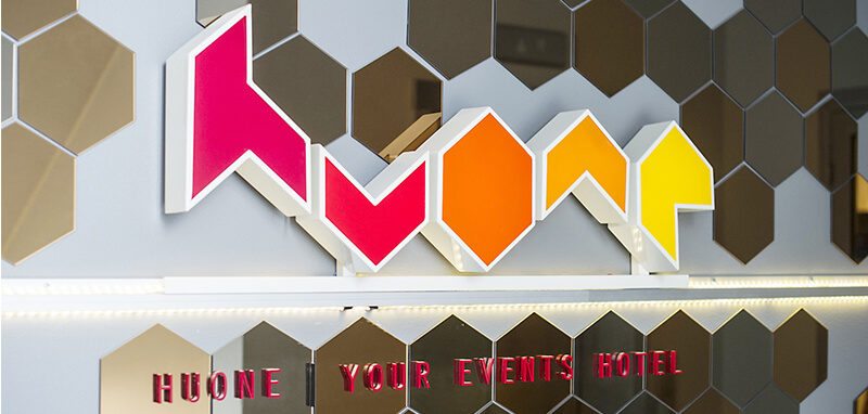
The original logo
Well, it was quite clear from the beginning. Most people thought that it was just a nice figure we came up, maybe a dragon, snake, Peckman… it goes on. I have to painfully admit that they were all right, and all those comments deserved more thoughts and discussions. However, the biggest hurdle was me, the founder with an emotional burden. Everyone knew how much it meant for me, and many had to tiptoe around with the harsh truth: we need to do something.
This harsh truth became very clear when HUONE decided to go to Singapore. No one was able to see the big vision with our logo. It was the first time I agreed to do something about it and decided to tweak the logo. This time, we hired a branding company.
Well, guess what. I was very reluctant because I didn’t see HUONE. I didn’t see playfulness, fun, and the warmth. I had to do what my heart was telling me, and rejected the proposal. And it turns out, our logo was quite an interesting introduction to our customers, and a nice story to tell. So, the Singapore team accepted the logo as it is.

The proposed logo version 1
Logo and Branding: HUONE becoming a global brand
Expanding to Copenhagen, we were faced with the same challenge. This time, I had to accept the fact that if people cannot recognise and read ‘HUONE’ from our logo, it failed at doing its job. Especially word being exotic Finnish puts this challenge a notch high (I am, and always will be, proud of its Finnish identity going global)
However stubborn I am, how passionate I feel about my baby’s original look, I decided to let it go. The process wasn’t easy; many marketing managers would understand how painful changing logo process can be: the amount of work, thoughts and considerations that goes into it is not a joke (thank you Meri). But we did it!
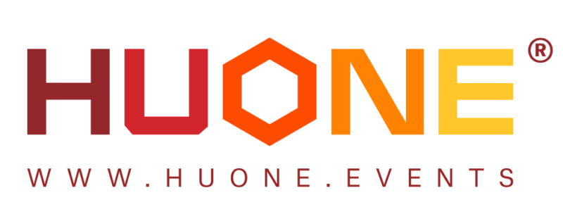
New Logo
Our new logo is refined, but still the original feeling remains. It is, most importantly, more legible. We decided to evolve, so that it works better in many other places, which is aligned with our vision–to be international

The new logo, designed by Mika Mäkinen, Don & Branco
A lot of companies have changed their logos over the years. The reason behind? it varies. Some do it purely because the public grew tired of an original logo, sometimes it’s a design upgrade, or it’s for a shift in the business offerings and so on.
For HUONE, the reason has been very clear from the beginning. However, I have to admit that it was not easy, and in fact, I am still digesting it. I know that it was the right decision, and I am very happy and excited at the same time that HUONE’s growing, and evolving just as we all are in this company.
It is still HUONE. HUONE is always going to be the same HUONE as day one. Just more recognisable, and global.
So, don’t be shocked when you recognise our new logo popping up somewhere. You can be happy with us, for the fact that we are growing 🙂
Sincerely yours,
Evon Blomstedt (formerly Söderlund)
Group CEO, HUONE International


